Tuesday, 21 May 2013

Task 7

We're in the top 5, so it's definitely time for a difficult task! I've had this idea in mind for a long time, before it was posted on SNTGD. Although it was one of their final tasks, I decided to use it here aswell:

Create a cd cover for the following singles. Your medoll has to be included and it shall be the focus of the cover. Nevertheless, the background is very important for the impression of the cover graphic. Include the band's/singer's name as well as the single's title on the cover. As it is a CD cover, the size has to be 12cm*12cm. Try to make your graphic fit to the song and write a short text, why you chose your cover.
Important: Don't try to look like the singer, this is NOT a look-a-like. Try to incorporate the song into your cover, expression is more important than looking good (but both is relevant).

Carrie: Bruno Mars - Money makes her smile

Clara: Nancy Sinatra - These boots are made for walking


Johanna: Guns 'n' Roses - November Rain

Manda: Mika - Lonely Alcoholic

Mangun: Wiz Khalifa - Young, wild and free

Good luck!
Give your best or you'll be eliminated!
Deadline is the 01.06.2013, 6pm GMT

xoxo Cathérine

Monday, 20 May 2013

Results of Task 6

Hello everyone!

Finally the results are here! Read the given task again here:

ashley_doggett
Ashley had to leave the competition due to personal reasons. Thanks a lot for participating and we wish you all the best for your modeling career!

Cheekycazbo1

click to enlarge
Judge 1: "First of all, I'm really a fan of the logo you created! The graphic quality of the hat is really good, especially compared to things you did previously. But still, as in many of your other entries, I'm definitely missing the wow-effect, your commercial just doesn't attract me that much. The colour scheme is quite pale and especially the white background extremely boring. My advice for the next task: Think OUTSIDE the box! Otherwise, you won't improve."
Judge 2:" I really like this hat! Great colours! Just not that much extravagant, but good hat! About the graphic, try to improve your skin shading."
Judge 3:" I really like this. The hat is definitely original, and although its not something I could imagine wearing myself, it'd be a perfect fix for any risk taker. My main concern though is the fact that I wouldn't exactly be able to tell what company I could purchase the hat from. The logo should be one of the main focus' of the graphic (aside from the hat). Keep this in mind!"
Judge 4:"The Hat is ok but nothing that look like WOW. Your Hair is very boring I wished it would be a little bit more voluminous. But I like the colors."


claragoosmann19

Judge 1: "Whereas I really like your slogan, I'm not too happy with the graphic itself. My favourite part has to be the head which is extravagant and beautiful at the same time. But the rest of the graphic, especially the hair and the neck lack definition for me, they just look as if you've just put some effects on a photograph. Besides, your makeup is quite boring, I'd loved another lipstick. Overall, a quite average entry but with a lovely hat."
Judge 2:"I love the overall picture, it makes me want to stay starring at her, but then I founs many things that I think if you improve it would be so much better. First, the hair, if you made a great hair the picture would be awsome since it captures our attention, then the skin shading, if these two things were better it would be really awsome. I also think you should add some movement to the model, or some pose. I love the hat, simple but at the same time extravagant!"
Judge 3:"This is one of my favorites of the task. Though the hair is using photo filters - something I really think lowers the quality of the graphic - and you didn't have any noticable brand logo for the hat you are selling, I think you accomplished the true task at hand: advertising an extravagant hat."
Judge 4:"I love your Graphic it´s so beautiful, elegant & of course majestic. Everything fit perfect together your background looks great also your Make up & Hair. It looks fresh and when I see it I have spring fever. Very well done."

smiling.jojoo

Judge 1: "Compared to your first entries, this is just gorgeous. But still, you were one of the weakest this week if you ask me. The colour scheme pulls me off and the graphic quality especially of the skin is not as good as it could be. Your hat is nice, but it isn't as extravagant as some other pieces. But although you didn't execute it well, your idea of showing a naked woman to put the focus on the hat was good."
Judge 2:"At first it lookes really good, but then I just noticed that the face doesn't fit in there, I don't know why. The hat looks good but I don't really understand what are those green things. The hair is kind of really bad. But I like the colors, and great pose!!"
Judge 3:"The hat is the main focus of the graphic, which is what I'm majorly judging by, so that's good. My main concern is that the text and background just make the graphic "sketchy" and "disorganized." The skin and hat shading could be improved, but for the most parts it's a good entry."
Judge 4:"Your Hat is really good, creative and I like the color also your Pose is very good but I don´t like the Hair its very boring and it should be a little bit more voluminous. "

MandaMichalka

please give a direct (i.imgur.com/...) link next time
Judge 1: "Very majestic! I love the feathers on your hat and the overall add. Nevertheless, I have some small things I dislike (colour of the hat, rushed top and the neck). But the positive aspects definitely outweigh the negative. Great entry!"
Judge 2:" OMG, OMG I love it so much, I'm speechless! I love the colours, I LOVE the hat it is so awsome, great details on the hat, the peacock inspiration ( I love peacocks) . The hair looks so good and fierce!! The skin shading and the dress look so awsome! Amazing pose, your make-up really fits here! The overall picture makes me want to stay starring at it for hours! Great slogan! I really think you got it! SO AMAZING!"
Judge 3:"I love how fierce the hat is! If I were to see this in a magazine, I would've thought you were selling either both the hat and dress or the makeup. The skin shading is one of the higher quality than the other contestants, but the collarbone has a weird shape to it, and the hair could also use some extra work. For the most part, good job, though!"
Judge 4:"WOW your Hat is incredible! Everything is perfect the Dress fit perfect to the Hat its kept simple that’s very good so the hat comes very well for retribution and your Make up is perfect too! Very very well done!"

mangunmeetan

Judge 1: "Congratulations for doing this in an hour. I'd never be able to this ins uch a short time. But still, this competition isn't about the time only. Your ad is quite boring and the hat is not the centre of attention as it isn't completely visible and the font is written over it. But thumbs up for following the rest of the task ;). I like the top, the necklace and the elegant retro feel of the graphic. the slogan is nice, too. But you seem to have two different skin colours and no face shading. I know (e.g. from MMM) that you can do better! But overall, the ad isn't that bad but not spectacular either."
Judge 2:" I'm not sure about this, I really like the face, but I think it's kind of the only thing I really like it here, because there's no pose, the hat is a real image (I think) so it wasn't made by you, the skin shading is off..."
Judge 3:"Another one of my favorites, I think you've both been able to maintain focus on the hat, and also incorperate the brand of where I can purchase it. I might change the color of the dress to something a little duller, so it'll bring even more focus to the hat. Well done!"
Judge 4:"I love your Hat! He fit perfect to your cute Hair. Your Dress with the pearl necklace is very nice too. The only negative thing I can say is that the hat could be more colorful but very well done!"


So who will be eliminated this task? The answer is: no one. Since Ashley left, I proudly present you the TOP 5 of Cathérine's Model Academy Cycle 1:

Stay tuned for the next task!

xoxo Cathérine

Monday, 13 May 2013

just a short note

I'm hyperbusy at the moment so you'll still have to wait a few days to see the results, sorry for that.

Friday, 26 April 2013

What?

What happened?
Yesterday was the deadline and I only got one contestant#s entry until then.
I'm a little confused.

But you'll get more time. Please tell me in the comments how much time you still need.
Thanks

xoxo Cathérine

Sunday, 21 April 2013

In a big package...

... the ordered prizes for the winners of Task 4 and 5 were delivered today.
Just take a look at them and congratulations if you're modeling for one of them!

graphic by icanglow's suitcase

Carrie for Crystallam2000

Wednesday, 17 April 2013

Task 6

Hi!

The winner of the week of task 5 is ... Clara!
Congratulations, you win this prize:


Task 6:
Create a commercial for an extravagant hat.
The graphic should be a close-up (which means that not the whole body should be seen and the focus has to be on the face and the hat). Since it's a commercial, a slogan and a brand have to be included.
Make your commercial outstanding but not too edgy.

The featured hat (not a fascinator) shall be extravagant, outstanding and maybe a little crazy.
For the overall theme and slogan, think in the direction of horse riding races, royals, ...
Some inspiration:


Deadline: 25.04.

xoxo Cathy

Monday, 15 April 2013

Results Task 5

Hey everyone!

Excited for the results of task 5? Before I post them, I first have to announce some news.
Kirsten left the judging panel before judging the task.
So we have a new regular judge which is ... Lindsey aka LoveGossip4life!
Click here to read more about her.

The guest judge for this task is Kathy aka dubistdie:

Besides, I decided to keep posting the judge's comments anonymously. But I will tell you which judge saw which contestants in the Bottom 3 and Top 2. Now to the results:

ashley_doggett

Judge1: You definitely included spring trends in this graphic! I'm not so sure of the legs, they look as if the model was shaking instead of walking. Besides, yu seem to smile too much. My favourite part of the graphic is the background, very detailed!

Judge 2: Really good! I love this collection, so you made a great choise! The background is nice, you just need to work on the skin shading!

Judge 3: Simple Black & White Outfit but very nice. The Background is also good. I only don´t like the Bow on your Head & the Earrings I think Silver one would be better.

Judge 4: This is right on trend-wise. I actually am not a huge fan of monochrome, but the way you portrayed it made me fall for it. I really like the runway, but what I'm not crazy for is the shading. I don't see much of an appeal with strictly blurring--maybe try making more layers, and try to lower the strength of blurring. Another thing I think you should work on is the model's expression. While it was a fresh breath of air seeing a model smiling, I think the expression the model held was a bit too cheerful for the outfit she wore. Maybe I also just am so used to runway models holding a scowl.

Guest judge: I’m sorry but for me this is not what i think about prêt-a-porter when I look at your picture.
The part of your legs isn’t cutted out very good. Although I can see your idea and I like the background but I can’t see an improvement in this entry.

Cheekycazbo1

Judge1: It#s ok, just the colours don't look good for spring and the green ruffle is horrible. but well done graphicwise.

Judge 2: Nice outfit and nice background! You just have to work on the shading of the clothes and the skin! But it's a really nice picture!

Judge 3: Aww your Outfit and Runway are very cute. Love your Outfit everything is nice I only missed some accessories.

Judge 4:  If anyone knows me, they'll know I love me some ruffles. And this season has plenty of gruffles--as its called. I think your entry was fairly strong, I think other than the ruffles, it didn't possess the traits that many of the S/S trends have. I think it was rather safe, and I think you could've taken a few more risks. I also am feeling a more Spring vibe, which if you're trying to create an outfit that'll suit both the spring and summer season, this outfit isn't one of them. I think the hair isn't too bad, you're certainly on the right track hair-wise. Besides a few minor details, this is a great entry!

Guest judge: I like your entry. It’s not perfect but it’s still very good but you should highlight so much more!


claragoosmann19

Judge1: A-M-A-Z-I-N-G! Love the dress, the pose and your facial expression. To get even better, work on your hair shading.

Judge 2:  Nice dress! But you look really small, and u should look a little bit more tall! If you practice your skin shading it will turn out much better!

Judge 3: Wow your Dress is amazing I love it so much! Your Hair & Pose are also very good only Point I missed the Jewelry. Very good Job!

Judge 4: I instantly fell in love with this graphic. Turquoise is one of the hottest trends this season, which is something you got right on. That along with the unique printing, I'd definitely expect this to be something seen on the runway. I am a bit torn though. From the neck down to the hemming of the dress your shading was near imppecable! From that, I had no complains. Although, the legs is where it gets a bit shaky. It looks as if you added a streak of burning and dodging, which lowered the overall quality of the graphic. The shoes could use some more work, but its not to the point where it's bad, either. Overall, i think you did an amazing job--It was definitely one of my favorite.

Guest judge: I really like your dress. Maybe your shading is a little bit to harsh and you’re the pose of the foot on the left side looks not really naturell. Although I think your entry is all in all very good.


smiling.jojoo

Judge1: Your outfit is very nice, perfect for spring as well as the shoes. But what really takes my attention off from the dress is the boring and ugly background, it's much too basic! You graphic quality has become better but you still have to improve clothes shading.

Judge 2:  wow, I love this! The dress looks so great! The skin shading is really good! And I see lots of improvement on your graphic skills!

Judge 3: Love your Dress, Hair & Background and I don´t have anything else to tell you

Judge 4:  I think your entry was one of the lesser quality entries, and to be completely honest the only thing I was maybe slightly fond of was the dress. The other items--including the skin shading and hair--weren't as great as I'd like it to be. Although it's in no way the worst, I think with some more time, it'd advance in quality heaps. Other than that, good job!

Guest judge: Wow I love this dress! When I look at your image it feels like and angel is coming up to me haha, I think it’s because of the highlighting! I’m not sure if your hair ffits to the rest but I like that you choosed a spring inspired runway (the grass). Well done!


MandaMichalka
(please send me a direct i.imgur... link next time)

Judge1: The graphic is nice, especially the background but it's nothing too special. I'd love to see longer hair next time and a better shading (see tips of judge 4).

Judge 2:  This is so great!! I really like it! Really good background! The clothes shading looks so awsome! And also the skin! The shoes looks a little bit awkward though.  But the whole picture is awesome!

Judge 3: Very, very Good! I love your Dress, the Background is perfect, the Make-up is wonderful  & you take nice Hair.

Judge 4: Even if you were using a designer's reference to make your outfit, I just wasn't feeling the S/S vibe from your graphic. I found the shading also to be really dark, and random shadows in the wrong places. On the bright side, your hair shading is improving tremendously--the highlights and shadows in your hair is right on! I think you have a good chance at winning if you paid more attention to where shadows go.

Guest judge: Manda, I really like your entry! Your Outfit is prêt-a-porter and I adore your background, it fits perfect! You improved in shading and highlighting! Great!


mangunmeetan
Judge1: Your graphic has a good quality, you only have to improve your hair and hands a lot (try adding more dark shadows on the hands). I like the vibe from the graphic, just the background is too blurry. But what I don't see in this task are the Spring/Summer trends 2013. Monochrome? No. Sorbet colours? No. Skater Skirts? No. (could be continued)... The second time in a row, you didn't completely follow the task! not so good... but the graphic is lovely nevertheless.

Judge 2: wow, this one has the wow factor because of the clothes! the clothes are really nice! But the hands look really awkward and also the hair! But really good clothes!!

Judge 3: Wow your Doll look amazing in that Dress! It´s not my taste but you look perfect with it

Judge 4:  I'm sorry, but I don't see much of S/S other than the small detailing on the shirt. Perhaps you were trying to incorporate a different culture into your graphic, but in the end, that wasn't the ultimate goal. I think you need to pay more attention to the task at hand. Other than that, I think your shading is well done, especially in the outfit. The hands could use some work, as well as the hair, but other than that, I think you did well. I think that you didn't pay attention to the task, it may put you in risk of elimination. Good luck, though!

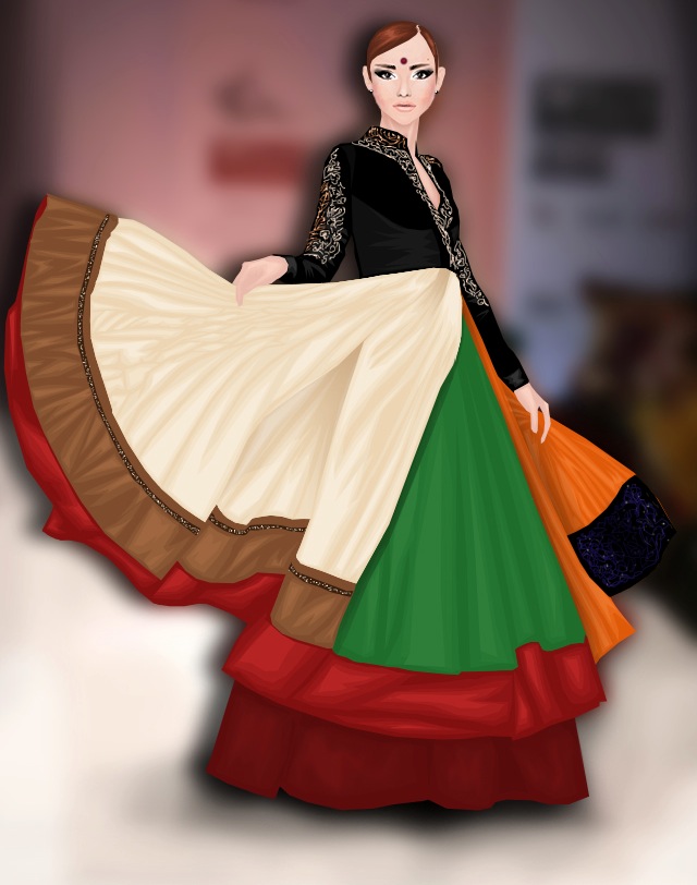
Guest judge: Wow! I really like your entry. The indian style was a good idea. The shading looks pretty good and the pose of your doll is oustanding, like you’re shaking your skirt and want to turn back to the beginning of the runway haha. The impression of your face fits perfect.


Rei1981

Judge1: Your entry is missing the wow-effect. Neither the graphic quality nor the outfit is extraordinary. You definitely have to improve in clothes, hair and knee shading. I'm sorry to say but I have the feeling as if this wasn't enough.

Judge 2:  I'm sorry but this one is one of the worst entry's :/ You haven't shown any improvment since your other entry's. And the other contestants have improved. You really need to work on your graphic skills.

Judge 3: I think the same like Judge 2.

Judge 4:  I'm sorry, but I'm not a huge fan of this. It was really quite blurry, and quite choppy in some areas. The hair could use work, but quite frankly, its my favorite part of the outfit. I also don't see much resemblance to S/S trends. I think you just need to work on your graphics, and you'll slowly see improvements! I think you've got great potential along with all the other contestants!

Guest judge: I comparision to the other entrys is this one not the best. I think your background is okay but I think you could have worked more at the skin shading use layers!! The Outfit for me is not really prêt-a-porter, I’m sorry.

Top 2 (from best to second best):
Lindsey: claragoosmann19, Cheekycazbo1
Raul: claragoosmann19, MandaMichalka
Joao: MandaMichalka, mangunmeetan
Moi (Cathérine): claragoosmann19, mangunmeetan
dubistdie: mangunmeetan, MandaMichalka

Bottom 3 (from "best" to worst):
Lindsey: mangunmeetan(just because she didn't follow the task), smiling.jojoo, Rei1981
Raul: smiling.jojoo, Cheekycazbo1, Rei1981
Joao: claragoosmann19, Rei1981 (couldn't decide for 3)
Cathérine: Cheekycazbo1, ashley_doggett, Rei1981
dubistdie: smiling.jojoo, ashley_doggett, Rei1981

I planned to eliminate two contestants but the general quality is too good to eliminate 2 of you in one round :3
That's why only one person will be leaving us.
Reina, I'm sorry, but this time, it just wasn't enough. But I'm sure that you will continue modeling and wish you the best for your magazine! Thanks for participating!

The winner of the week will be announced together with the next task.
Stay tuned!

xoxo Cathy